

If accessibility first appears at launch, the important decisions have already been made
A launch audit can find a missing form label, a broken keyboard focus state, or a button that a screen reader cannot identify. It cannot easily undo the design decisions that caused those problems in the first place.
If the page structure is built around visual positioning rather than a sensible reading order, the fix may require new markup and layout work. If a form was designed without room for clear error messages, the team may have to redesign the interaction. If a navigation pattern depends on hover, animation, or a pointer gesture, the problem began in the concept, not in the final quality-assurance pass.
That is why accessibility testing during design is the right starting point. It is not the whole testing process. The strongest approach is layered: review the experience while it is still a prototype, test the coded components as they are built, involve people who use assistive technology, and complete a pre-launch assessment. WCAG 2.2 is written with testable success criteria that can be used in design specifications as well as conformance testing. (w3.org)
The numbers argue against a launch-only test
The WebAIM Million 2025 report found detected WCAG failures on 94.8% of the top one million home pages. Source: The WebAIM Million: 2025 Report.
WebAIM detected an average of 51 errors per home page in its February 2025 analysis. Source: The WebAIM Million: 2025 Report.
Low contrast text appeared on 79.1% of the home pages tested. Source: The WebAIM Million: 2025 Report.
Only 17.6% of respondents to WebAIM's practitioner survey said automated testing detects 50% or more of total accessibility issues. Source: Survey of Web Accessibility Practitioners #3 Results.
In the FY 2024 Section 508 assessment, 53% reported regularly, frequently, or almost always integrating conformance into technology development lifecycle activities. Source: Governmentwide Findings: Accessibility Conformance Testing and Technology Lifecycle.
Design review catches the choices code cannot repair cheaply
The design stage is where a small business can remove entire classes of problems before they spread across templates and components.
Check whether text and controls have enough contrast. Check whether headings, landmarks, and content groupings make sense as a sequence rather than merely as a visual composition. Check whether link labels explain their destination. Check whether forms provide visible labels, instructions, useful error messages, and a clear route back to the problem. Check whether interactive controls remain understandable when enlarged, viewed on a small screen, or used without a mouse.
These are not abstract accessibility exercises. Take a service-page enquiry form. A visual mock-up may show a neat row of fields with placeholder text inside each input. During design review, the team can replace those placeholders with persistent labels and reserve space for error text. That decision is quick in a design file. After development, it may affect the component, validation logic, responsive layout, analytics events, and every page using the form.
The GOV.UK Service Manual makes the same distinction: rough prototypes do not need production-quality accessible code, but teams should still check decisions such as colour contrast. It recommends thinking about accessibility from the start, then testing production code regularly. (gov.uk)
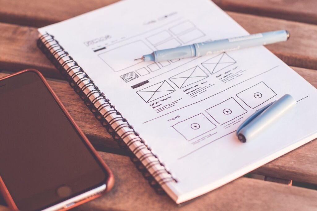
Design-stage review versus launch audit
| Criterion | Accessibility testing during design | Accessibility testing at launch |
|---|---|---|
| Catches visual and content decisions | Strong. Contrast, hierarchy, labels, wording, and interaction concepts can change easily. (better) | Limited. The decisions are already embedded in the finished interface. |
| Tests real keyboard and screen-reader behaviour | Limited unless the prototype is coded or tested with a realistic interactive prototype. | Strong. The actual DOM, focus order, states, and assistive-technology output can be assessed. (better) |
| Prevents repeated defects | Strong. A shared component or pattern can be corrected before it appears across the site. (better) | Weaker. The same issue may exist on many pages and templates. |
| Confirms the finished customer journey | Weak. A design file cannot prove that the built experience works. | Strong, provided the review includes manual testing and assistive technology. (better) |
A design file is not an accessible website
This is the part that gets lost when teams say they are shifting accessibility left. Early review is valuable, but it does not make the launch audit optional.
A design tool can show contrast and hierarchy. It cannot reliably prove that a keyboard user reaches controls in a sensible order. It cannot show whether focus remains visible after a modal opens. It cannot confirm that a custom dropdown exposes the right name, role, value, and state to assistive technology. It cannot reveal that a developer has attached the wrong label to a field or caused a status message to disappear before a screen reader announces it.
The coded site also contains content that did not exist in the mock-up: real headings, editorial images, validation messages, embedded videos, third-party widgets, cookie controls, and mobile breakpoints. Those need testing in the browser. Automated tools are useful for repeatable checks, especially when connected to component and deployment workflows, but they are not a verdict. WebAIM’s practitioner survey found that fewer than one in five respondents believed automation could detect at least half of all accessibility issues. The GOV.UK guidance explicitly recommends both automated and manual testing because relying on only one misses problems. (webaim.org)
A practical accessibility testing sequence for a small website
-
Set accessibility requirements before visual design
Choose the target standard, usually WCAG 2.2 AA where that is appropriate, and identify the customer journeys that cannot fail.
-
Review the structure and interaction concepts
Inspect headings, navigation, forms, contrast, link purpose, motion, error handling, and responsive behaviour in wireframes or prototypes.
-
Test reusable components as they are coded
Run automated checks on representative components, then inspect keyboard behaviour, focus, names, states, and dynamic content manually.
-
Test realistic content and complete journeys
Use the actual service enquiry, booking, purchase, contact, or application flow rather than isolated sample screens.
-
Include assistive technology and disabled users
Test with the screen readers, speech input, keyboard methods, magnification, and other tools relevant to the audience. W3C recommends involving people with disabilities throughout design and development, not only at the end.
-
Run a pre-launch review and keep testing after release
The final audit should confirm the built experience, while ongoing checks protect the site when new pages, plugins, campaigns, and content are added.
Practitioners are using both automation and manual testing because each exposes a different risk
The real-world pattern is less ideological than the phrase “shift left” suggests. Teams do not choose between early testing and final testing. They add checks at the point where each check is most useful.
In the FY 2024 federal Section 508 assessment, reporting entities described widespread use of manual developer-tool checks, assistive technology, manual code inspection, and automated monitoring. Yet the same assessment found that early lifecycle integration remained uneven, and that user testing with people with disabilities was still not routine. This is a useful warning for small businesses: having an accessibility scanner is not the same as having an accessibility process. (section508.gov)
For a small site, that process does not need a large department. The designer can review contrast, hierarchy, focus assumptions, labels, and error states before development. The developer can use semantic HTML, test with a keyboard, run an automated scanner, and inspect the accessibility tree. The owner or project lead can arrange a focused review of the highest-value journey with people who use assistive technology. A specialist audit can then test the finished site and help prioritize defects.
The important operational decision is to test shared patterns first. A problem in one button, form field, dialog, or navigation component can multiply across the site. Fixing the pattern before it is copied is usually more useful than finding the same defect on twenty finished pages.

The answer is earlier testing, followed by better testing
Accessibility testing should happen during design rather than waiting for website launch. That is the clear answer to the timing question. But “during design” should describe the beginning of the process, not its endpoint.
Use design review to prevent inaccessible concepts. Use development checks to catch implementation defects. Use manual testing and assistive technology to examine behaviour that automated tools cannot judge. Use people with disabilities to test whether the experience works in practice. Then use a pre-launch review to make sure the complete, content-filled site is ready for customers.
This is also why accessibility belongs beside the technical foundations of a website, not as a cosmetic pass at the end. The same thinking applies to the broader principle behind small-business websites being boring under the hood: simple structure, semantic markup, predictable interaction, and restrained dependencies give a team fewer ways to create barriers.
Launch is the deadline for proving the site works. It is a poor moment to discover what the site should have been.
