A homepage is often the first impression your business makes online, yet too many websites confuse visitors with cluttered design and unclear pathways. For serious business owners focused on clarity and leverage, structuring your homepage isn’t just about aesthetics — it’s a strategic decision that dictates whether visitors stay, convert, or bounce away.
Effective homepage structure directs visitors seamlessly toward your desired action, reducing hesitation and increasing trust. By mastering subtle UX cues, intelligent layout, and clear messaging, you can guide users confidently from curiosity to conversion.
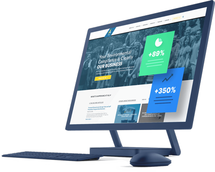
Designing Homepage Structure with User Intent in Mind
Your homepage must answer a simple question within seconds: "What should I do next?" To achieve this, start by prioritizing your user’s intent. What are the main actions you want visitors to take? Whether it’s subscribing, contacting you, browsing services, or booking a consultation, clarity is key.
- Focus your above-the-fold area on one primary call to action (CTA). Avoid multiple conflicting messages or buttons competing for attention.
- Use concise, benefit-driven headlines that communicate value immediately.
- Employ directional cues like arrows or whitespace to guide the eye naturally.
Altflex recommends testing these cues for subtlety and effectiveness — learn more about subtle UX cues that build trust on service websites.
Key Sections to Include for a Conversion-Focused Homepage
A well-structured homepage typically breaks down into these core sections, each designed to progressively build engagement:
- Headline and Subheadline: Clearly states what you offer and the benefit.
- Primary CTA: A prominent button or form above the fold.
- Supporting information: Brief paragraphs or bullet points that address pain points or value propositions.
- Social proof: Testimonials, reviews, or trust badges increase credibility.
- Secondary CTAs: Options for less-committed visitors to explore more content.
- Footer with contact info and navigation: Allows easy movement and transparency.
Applying the FID Framework: Focus, Inform, Direct
Use the FID framework to map your homepage content:
- Focus: Start with a single dominant message that aligns with your core offering.
- Inform: Quickly educate the visitor about benefits and unique differentiators.
- Direct: Lead them to the next step with a clear, prominent CTA.
Integrating Visual Hierarchy and UX for Intuitive Navigation
Visual hierarchy ensures visitors’ eyes land on the most important elements first. To implement this:
- Use contrasting colors for CTAs to stand out.
- Employ typographic scale — larger fonts for headlines, smaller for details.
- Apply whitespace strategically to prevent overwhelming the visitor.
- Place navigation menus logically and keep them minimal.
Avoid overwhelming visitors with too many navigation options early; keep the primary focus on conversion paths.
Common Mistakes That Sabotage Homepage Effectiveness
Even well-intentioned business owners can fall into pitfalls that kill clarity:
- Overcrowding with too many CTAs — dilutes visitor attention.
- Jargon-heavy or vague copy — leaves visitors unsure about benefits.
- Lack of social proof or trust signals — greater friction in commitment.
- Ignoring mobile design adaptation — over 50% of visitors come via mobile, and experience must be frictionless.
Business owners should also ensure their website meets accessibility standards — check your site against ADA compliance criteria with this practical guide.
Leveraging Tools and CMS for Efficient Homepage Building
For business operators wanting to execute efficiently, selecting the right platform is crucial. Popular options include WordPress combined with page builders like Elementor:
- WordPress offers flexibility, SEO features, and integration options.
- Elementor enables drag-and-drop design with custom layouts and responsive controls.
Consider leveraging well-built website templates optimized for clarity and conversion, adjusting them to your brand voice and goals.
Practical Checklist: Evaluating Your Homepage Structure
Use this step-by-step checklist to audit or build your homepage:
- [ ] Does the headline clearly communicate your primary offer?
- [ ] Is the main CTA visible without scrolling?
- [ ] Are there supporting benefits or solutions listed clearly?
- [ ] Have you included trust elements such as testimonials or logos?
- [ ] Is the navigation focused and uncluttered?
- [ ] Are visual elements directing attention logically?
- [ ] Have you tested the homepage on mobile and desktop devices?
- [ ] Is your site operating with good loading speed and security protocols?
- [ ] Does your homepage align with your broader web strategies such as local SEO?
When to Rethink Your Homepage: Signs It’s Time for a Redesign
If your homepage struggles to guide visitors or conversion goals aren’t met despite solid traffic, a strategic redesign may be necessary. Redesigns allow you to reframe messaging, improve user flow, and incorporate updated design trends.
Before diving in, explore what goes into a website redesign to understand scope and investment realities — Altflex provides great insights here: What Goes Into a Website Redesign?.
Your homepage is not just digital real estate — it’s a conversion engine. To maximize its impact, apply these concrete structuring strategies and ensure every element serves a clear purpose guiding your visitors forward.
Ready to create a homepage that converts and builds lasting trust? Learn how Altflex can help you implement proven strategies tailored to your business goals at https://altflex.com/.