Your branding tells your customers everything — your values, voice, and personality. When it comes to conversions, 43% of people spend their money on brands they’re loyal to. Having consistent branding across all platforms is crucial for a solid brand presence.
Want to learn what to put in brand guidelines? Keep reading to learn more, and start brainstorming your own!
What are brand guidelines?
Brand guidelines — also known as a brand style guide — are standards that companies use to remain consistent across channels. These guidelines ensure that no matter where you see a brand, you can recognize it and trust that it came from the company.
Brand guidelines comprise:
- Visuals: Logos, colors, images
- Language: Typography, trademarks, personality
- Values: Your mission and goals
If you’re already using an omnichannel strategy or want to start, your brand guidelines might be part of your marketing plan.
Why do brand guidelines matter
Having consistent branding matters for multiple reasons. Here are our top three:
1. They help your team create cohesive material
Designers, copywriters, salespeople — everyone on your company’s team can use your brand guidelines to create a specific look and feel. Establishing rules can immerse employees in your company culture and help them represent your brand.
2. They create a uniform user experience
Branding guidelines make it easy to create content for any platform. Whether through email, social media, or your company blog, you have a basis for any content you make. Your team can create more personalized content and increase your reach.
3. They establish your identity
Your branding guidelines help you outline who your brand is and create a voice. Others agree — 77% of marketing leaders say branding is critical to growth.
Instead of shopping from a voiceless brand, customers can remember your message and personality. When customers know what to expect from your business, they will turn to you when they need your services.
Brand guideline examples
Every brand’s guidelines will look different depending on its personality, size, and industry. Many don’t share their complete branding online, but you can reference their guides for designers.
Spotify, Apple, and Starbucks are popular examples you can use as a baseline.
Spotify
Spotify, a music streaming platform, centers its branding around the user. They create personalized content and user-friendly data to give people more control over their music library.
Spotify has a distinct set of rules for developers connecting their software with Spotify. Let’s go through a few of their branding elements:
Logo
Here, the brand outlines its logo and icon preferences in detail, including the logo and icon. With these examples, Spotify can establish one clear logo that prevents variations.

Along with the logo downloads and examples, they also include what not to do with their logo. Being as explicit as possible and outlining all the possibilities ensures that developers and designers have the same information and use it correctly.

Colors
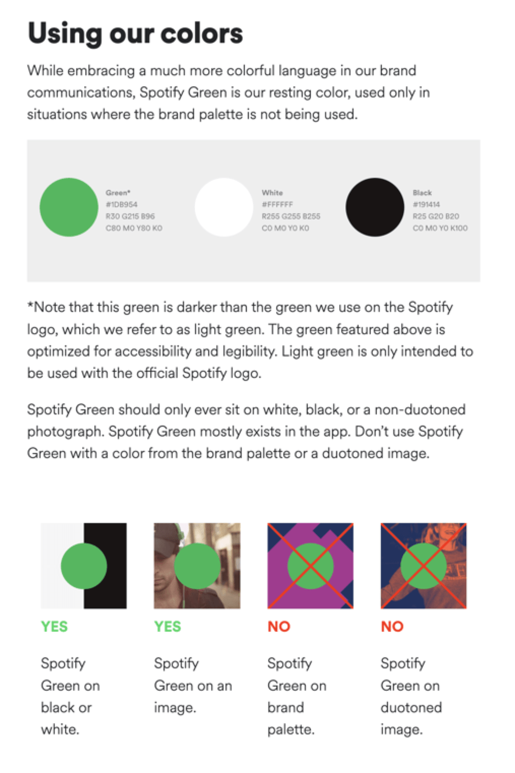
While Spotify’s colorful interface comes from album artwork or playlist covers, but green and black are the branded colors to watch for. You can access their colors in their branding guidelines, including how they layer them with other branding.
The guidelines include multiple formats (HTML and RBG) to be as clear and specific as possible.

They also include the difference between the shades of green and how each one appears within and outside of the app.
Formatting
Other sites and services can embed the Spotify player onto their platform, which poses the need for a unified format. Spotify outlines their preferences, including the album artwork, artist, track title, and more.
These guidelines make it easy to create a seamless experience and immerse the user in the brand.

Visuals matter to the user experience, and Spotify knows it. Having these guidelines available makes it easy to create an immersive streaming session.
Apple
Apple’s branding is sleek and simple. They want users to consider the product’s unique benefits without overloading them with features. That tidy branding is present in everything from their web design to their typography.
Product names
Like Spotify, Apple has a developer site where they outline their brand guidelines. On Apple’s developer site, you can see their product name specifications and how others should use them in copy.

This consistency helps establish memorable product names and spellings across the Internet. Users will encounter the familiar names, even if they aren’t on the Apple site. This organization will further engrain Apple’s brand recognition.
Trademarks
In the brand guidelines, Apple also includes legal requirements for trademark symbols.

This section is crucial for preserving Apple’s intellectual property. It also helps developers and others outside of the organization abide by any legal requirements. While this section doesn’t necessarily impact the customer experience, it does create a unified brand presence.
Starbucks
This beloved coffee chain would not be the same without its recognizable color and voice. The Starbucks branding guidelines outline visual and written elements to help developers appeal to senses other than taste.
Voice
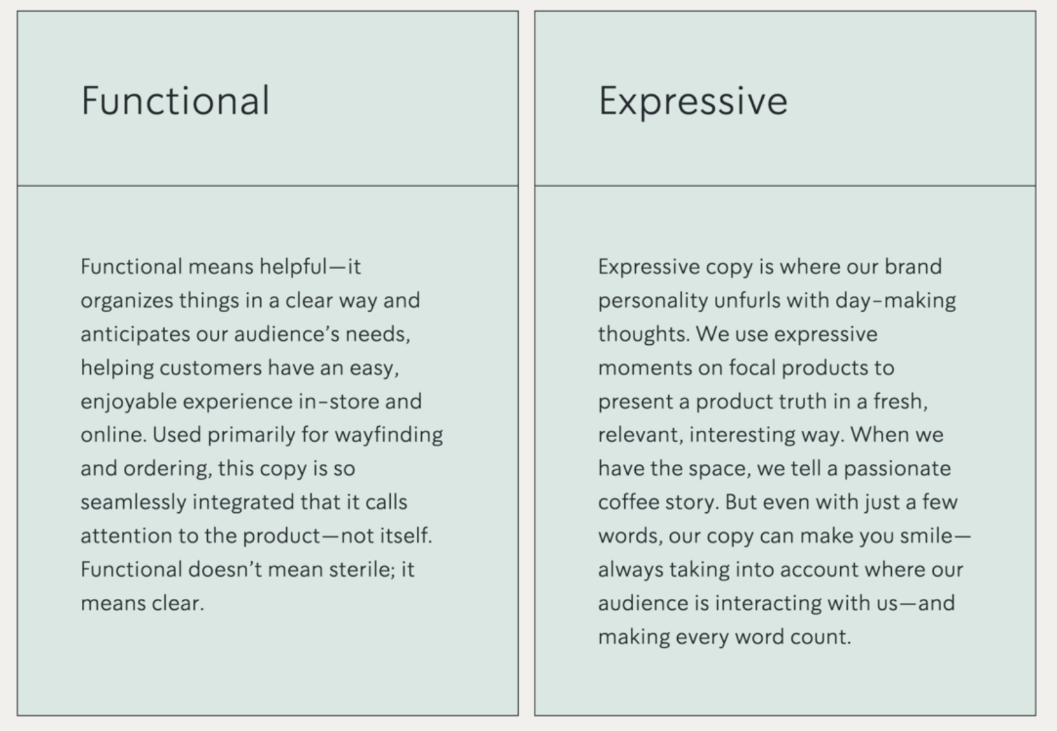
Starbucks outlines two types of copy that serve different purposes — functional and expressive.

These two sections highlight the different ways that Starbucks appeals to its users. On one hand, you have clear copy that gives direction or explains a product, like this matcha sign:

You can also use more fun, expressive copy, which evokes an emotional response. Their example is the Starbucks rewards program:

These two different voices speak to who Starbucks is — a helpful coffee company with delicious flavors for all guests. Writers can align their copy with the brand voice since Starbucks breaks it down into two basic categories.
Photography
Starbucks uses photography to amplify their voice and vision. While photographers can be creative, they must adhere to the following standards, so viewers know the photo comes from Starbucks.
The key components of any Starbucks photos are honesty and authenticity:

Starbucks uses images to promote their drinks and appeal to senses other than taste. Their photos highlight their products while telling their story. Product photos have the following guidelines:

You can see the difference between original shots and edited ones with this tool in their style guide:

For editorial photos, Starbucks wants to create relatable, moving images that their viewers can relate to:

With these guidelines, photographers can capture images that place Starbucks at the focal point. Since they value honesty, their photos should feel like regular life, only better, because Starbucks is in it.
All of these photography rules ensure a purposeful visual experience that makes you want a sip of coffee.
How to create brand guidelines
Now that you have seen some examples, it’s time to start preparing your own. The following list covers what to put in brand guidelines.
Mission statement and values
Your mission statement is what your company stands for. Many companies also have this information in their “about” section, but you must tie your branding into your mission. Why does your brand work? How does it accomplish that?
A strong mission statement will help people connect with your brand as a unified concept. They likely know your product and services, which are what you do. Your mission statement tells them why you do it.
If you don’t have a mission statement, you can list the values that you want your company to promote.
Voice
Your voice is what you say. Your tone is how you say it. Outlining your language style can help people understand your brand’s personality and messaging.
How you communicate matters to your industry. A health care clinic might not use a lot of flowery, comical language when they help patients with serious illnesses. Likewise, a daycare doesn’t want to come off as overbearing.
Decide how you want your brand to sound and stick with it.
Buyer personas
Buyer personas are profiles you create to represent your target audience. Instead of limiting your audience to the following:
- 85% female
- Age 25-35
- Middle class
Create a character that represents someone who would likely buy your services. For example, your buyer persona could be Sara, a 27-year-old receptionist with no kids. You could even be more thoughtful with personality traits, like someone who enjoys the outdoors or vacations frequently.
Once you think about your audience, you can understand what kind of people interact with your brand and keep your employees on board with who you are serving.
Colors
Your brand colors give users a signal to look for. Color can improve brand recognition by 80%, so outlining your colors matters.
Outline the HTML and HEX codes for your colors and make sure that you keep them consistent across platforms. If necessary, you can also trademark your product colors.
Check out these websites for examples of how to use colors in web design.
Branded terms
Make sure to list all branded or trademarked language, including:
- Slogans
- Product names
- Product features
- Company name
This step creates consistency across platforms and acknowledges any legal restrictions for trademarks.
Image preferences
If you have image size regulations or certain imagery, add it! This section can include your logos, designs, graphics, and more.
If you don’t have in-house resources for images — or any content mentioned above — consider partnering with an agency for extra help.


